The central idea
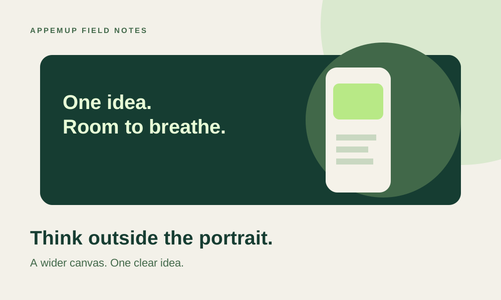
A feature graphic is a wide introduction to your app. Recompose the idea for a banner instead of shrinking a portrait screenshot.
Start with the destination
Google Play specifies a 1024 × 500 feature graphic in JPEG or 24-bit PNG without alpha. This is a different asset from a phone screenshot. Verify the current requirements in Play Console and the official preview-asset guide linked below when you prepare your release.
Use the banner to introduce the app's character and central task. A portrait screenshot often contains small controls and long vertical hierarchy that become unreadable in a wide space. Carry over the visual identity, but arrange the content again for this canvas.
Choose a focal point that survives a small preview
For a budgeting app, a clear product view and a restrained brand treatment can do more work than eight tiny charts. Decide whether the interface or a recognizable illustration leads, then remove competing elements. Use contrast to separate foreground from background and leave breathing room around the subject.
Keep critical content away from the edges and inspect the graphic at a small size. Different placements can crop or overlay parts of an asset, so do not rely on edge text to explain the product. Avoid store badges, unsupported awards and promotional claims that conflict with the destination's guidance.
Adapt a screenshot story without flattening it
In AppemUp, select the Google Play feature graphic output and review its wide composition. Move the device and copy as separate elements. Replace the source capture if the portrait screen is too dense; a different app view may explain the same benefit more clearly.
Keep the brand palette and typography connected to the screenshot set. Consistency helps the listing feel like one product, but it does not require identical placement. A headline at the top of a phone image may work better beside the device in a banner.
Inspect the exported banner, not just the editor
Check the exported dimensions and confirm the file has an opaque background in a supported format. Look for clipped device edges that appear accidental, unreadable app labels and captions that repeat the app name without adding meaning. Open it beside the icon and first screenshot to judge the set together.
Upload the asset to the destination console and review its preview before release. If you maintain multiple locales, check every localized composition rather than assuming a translated line fits the same space. Keep the editable project so the graphic can evolve with the next release.
- 1024 × 500 destination canvas
- Supported file format with no alpha
- One clear focal point
- Important content away from edges
- Small-preview and locale review completed
Sources & further reading
Platform guidance checked September 7, 2026. Workflows and examples are AppemUp editorial recommendations; illustrative examples are not measured results.
Ready to try it with your app?
Choose a template, add your captures, and build a screenshot story.
Open the free editor